| |
Sampling Plans | Site Map |
| Main Areas:
|
| Software Area: |
Acceptance
Sampling:
|
| Examples of TP414 for
Variables LISL Sampling Plans for Percent Non-Conforming |
visitors= |
- Contents
- Variables Data and p'=Percent Non-Conforming
- Table of p'=fraction non-conforming versus the lot mean
- Graph of p'=fraction non-conforming versus the lot mean
- Decision Rules
- Fixed-n decision rule
- Sequential SPR decision rule table
- Sequential TSS decision rule table
- Sequential SPR decision rule diagram (text)
- Sequential SPR decision rule exported from TP414 to an MS Excel chart
- Sequential TSS decision rule exported from TP414 to an MS Excel chart
- Comparison of Sequential SPR & TSS decision rules on an MS Excel chart
- Range test for known standard deviation plans
- Sequential slope and intercept
- Performance Curves (for matched fixed-n & sequential plans)
- p' versus the lot mean
- Performance curve tables by Pa
- Performance curve tables by p'
- Performance curve tables by the mean
- OC-Curve graph (text)
- OC-Curve graph exported & displayed as an MS Excel chart
- AOQ-Curve graph exported & displayed as an MS Excel chart
- ASN-Curve graph exported & displayed as an MS Excel chart
- ARL-Curve graph exported & displayed as an MS Excel chart
![]()
Table of p'=Fraction Nonconforming versus the Lot Mean

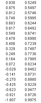
This table illustrates the nature of variables data for fraction/percent nonconforming. In this case, a lower individual specification limit (LISL) of 1.0 defines whether a measured item is non-conforming. The lower the mean of the lot, the greater the fraction of items in the lot that are non-conforming. When the lot mean is exactly equal to LISL=1, half of the items will be non-conforming and the other half conforming. The table demonstrates this.
![]()
Graph of p'=Fraction Non-Conforming versus the Lot Mean
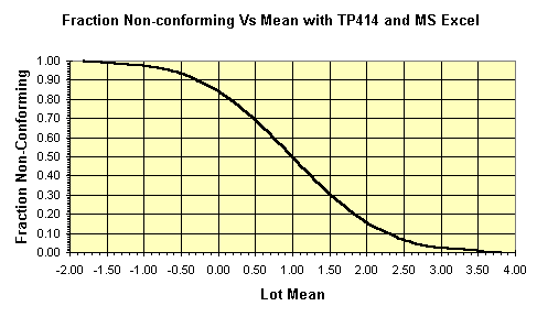
This MS Excel chart was made from the table above by exporting the table from TP414 to a file and then importing it into Excel. Then the Excel chart wizard was used.
![]()
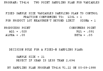
This fixed-n sampling plan documents the type of plan, the two points on the oc-curve that specified the plan, the decision rule, and the date and version of the software.
![]()
Sequential SPR Decision Rule Table
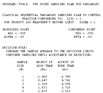

SPR refers to Sequential Probability Ratio. The Reject and Accept columns are to be compared to the average of the sample.
![]()
Sequential TSS Decision Rule table


TSS refers to Truncatable Single Sample. The Reject and Accept columns are to be compared to the average of the sample.
![]()
Sequential SPR Decision Diagram (text)
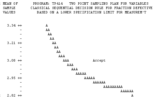
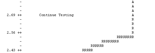
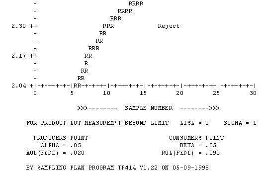
Note that the statistic used for the accept/reject decision is the sample average (y-axis), even though the AQL and RQL are specified in units of percent of individual items non-conforming to the specification.
This decision chart illustrates the most important property of sequential acceptance sampling plans - which is to reduce the sample size required, compared to the matched fixed-n sampling plan. The farther the sample average (y-axis) is from the middle value, 2.69 for the example shown, the lower the sample number (n) at which the accept or reject decision can be made. This property allows you to reduce the amount of testing/sampling ad-infinitum by properly targeting the process.
This favorable economic result is accomplished without compromising the sampling risks -- as expressed by the producer's risk, alpha, the consumer's risk, beta, and any other values of the oc-curve. They remain unchanged, regardless of the economic improvement in sample size. The Average Sample Number (ASN) curve will assist you to make use of this property of sequential acceptance sampling plans in your application
![]()
Sequential SPR Sampling Plan for from TP414
Displayed as an MS Excel Chart
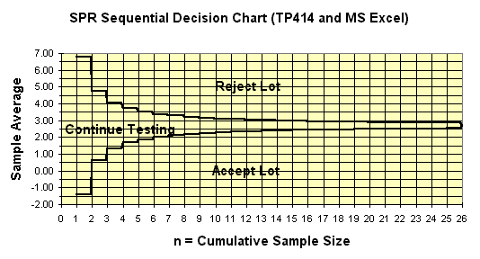
This MS Excel chart is produced by exporting the decision table from TP414 and importing into Excel. In Excel, you use the chart wizard to make the chart.
To effect the accept/reject decision for a specific lot, plot the data on the diagram sequentially as it is collected. When the sample average plots on or over an acceptance line or rejection line, the decision is made. The stair step pattern is caused by the discrete nature of the sample size and the number of defectives in the n-table upon which this diagram is based.
![]()
Sequential TSS Sampling Plan for from TP414
Displayed as an MS Excel Chart
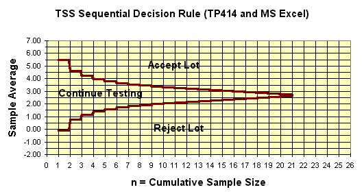
The TSS sequential plan works the same way as the SPR sequential. It has a major beneficial property that gives it an advantage. The TSS plan always truncates the sample size at the n of the matched fixed-n (single-sample) plan. (Thus the name Truncatable Single Sample). This property diffuses the counter-intuitive issue of how to truncate SPR sequential acceptance sampling plans.
Plot the data on the diagram sequentially as it is collected. The accept or reject decision is made when sample data plots on or over an acceptance line or rejection line. The stair step pattern is caused by the discrete nature of the sample size and the number of defectives in the n-table upon which this diagram is based.
![]()
Comparison of Sequential SPR and TSS Plans from TP414
Displayed as an MS Excel Chart
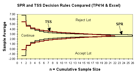
Even though SPR and TSS sequential acceptance sampling plans work the same way.
TSS plans generally have a more narrow continue region for very small sample size (n).
TSS plans generally have a more wide continue region for intermediate sample size (n).
TSS plans always truncate at the sample size of the matched fixed-n plan.
![]()
Range Plans of TP414
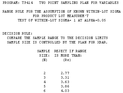
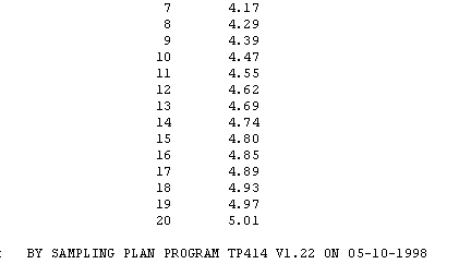
The range plan is used to complement variables plans based on known standard deviation. The range of the sample is compared to the values in the rejection column, depending the sample size. This decision table is applied with fixed-n plans or sequentially with SPR or TSS plans..
![]()
Slope and Intercept of Sequential Lines of TP414
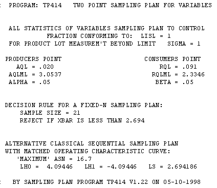
This report provides the slope (LS) and intercepts(LH0 & LH1) of the acceptance and rejection lines of the SPR sequential sampling plan. These are not usually needed to design and apply the plans, but are of use for those interested in theoretical aspects.
![]()
p' versus the Lot Mean from TP414 Displayed as MS Excel Chart
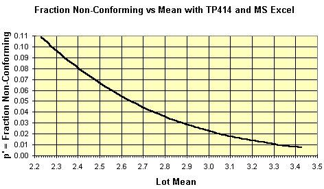
You can use this chart to interpret the performance curves below in terms of the lot mean.
![]()
Performance Curve Tables by Pa -- Matched Fixed-n & Sequential
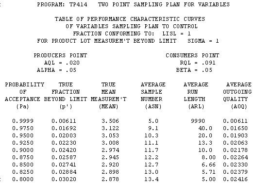
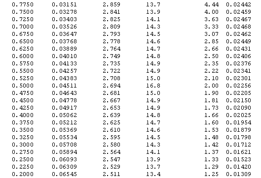

The left column (Pa) has constant step-size.
![]()
Performance Curve Tables by p' -- Matched Fixed-n & Sequential
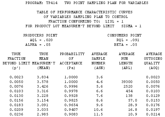
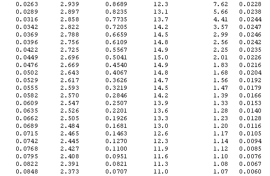

The left column (p') has constant step-size. This table was used to build the four MS
Excel charts below (OC, AOQ, ASN, and ARL)
![]()
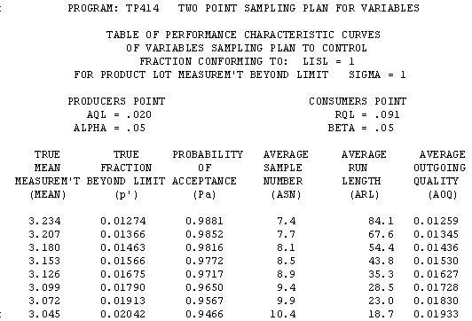
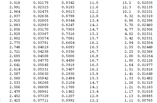
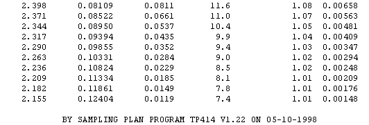
Performance Curve Tables by Mean -- Matched Fixed-n & Sequential
![]()
Operating Characteristic Curve Graph (text)
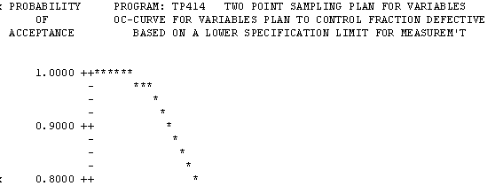

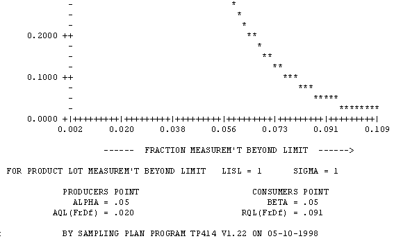
In most cases, this text graph is sufficient to evaluate and/or compare sampling plans.
![]()
OC-Curve from TP414 Displayed as MS Excel Chart
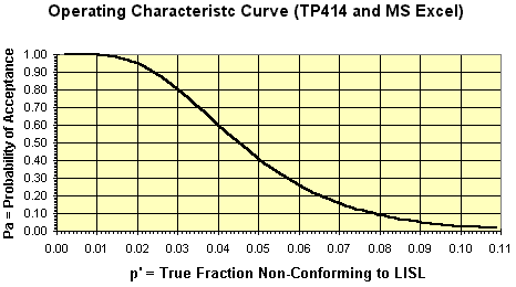
This chart was made with the MS Excel chart wizard after writing the TP414 performance table to a file, importing it into Excel, and using [data][text to columns] in Excel to parse the tabular data into columns. This procedure has been tested with Excel 5.0 and 7.0(7.0 is office 95)
![]()
AOQ-Curve from TP414 Displayed as MS Excel Chart
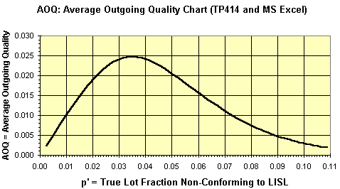
This AOQ curve is based on AOQ = Pa * c'. It is not adjusted for lot size.
![]()
ASN-Curve from TP414 Displayed as MS Excel Chart
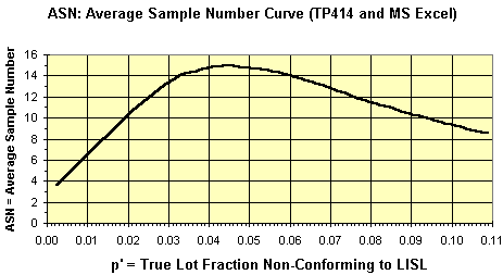
The ASN-Curve is useful to estimate the sample size that will be required by a sequential sampling plan for various lot mean defects per sample.
![]()
ARL-Curve from TP414 Displayed as MS Excel Chart
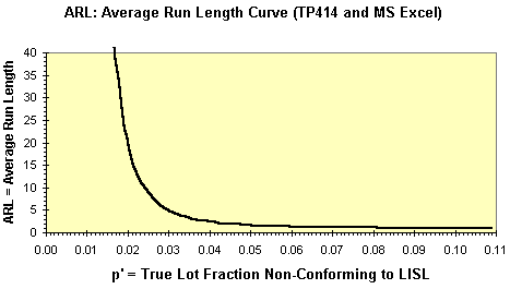
The ARL is the average number of lot acceptances (a run) before a lot is rejected. You want a high ARL at the producer's point and a low ARL at the consumer's point.
![]()